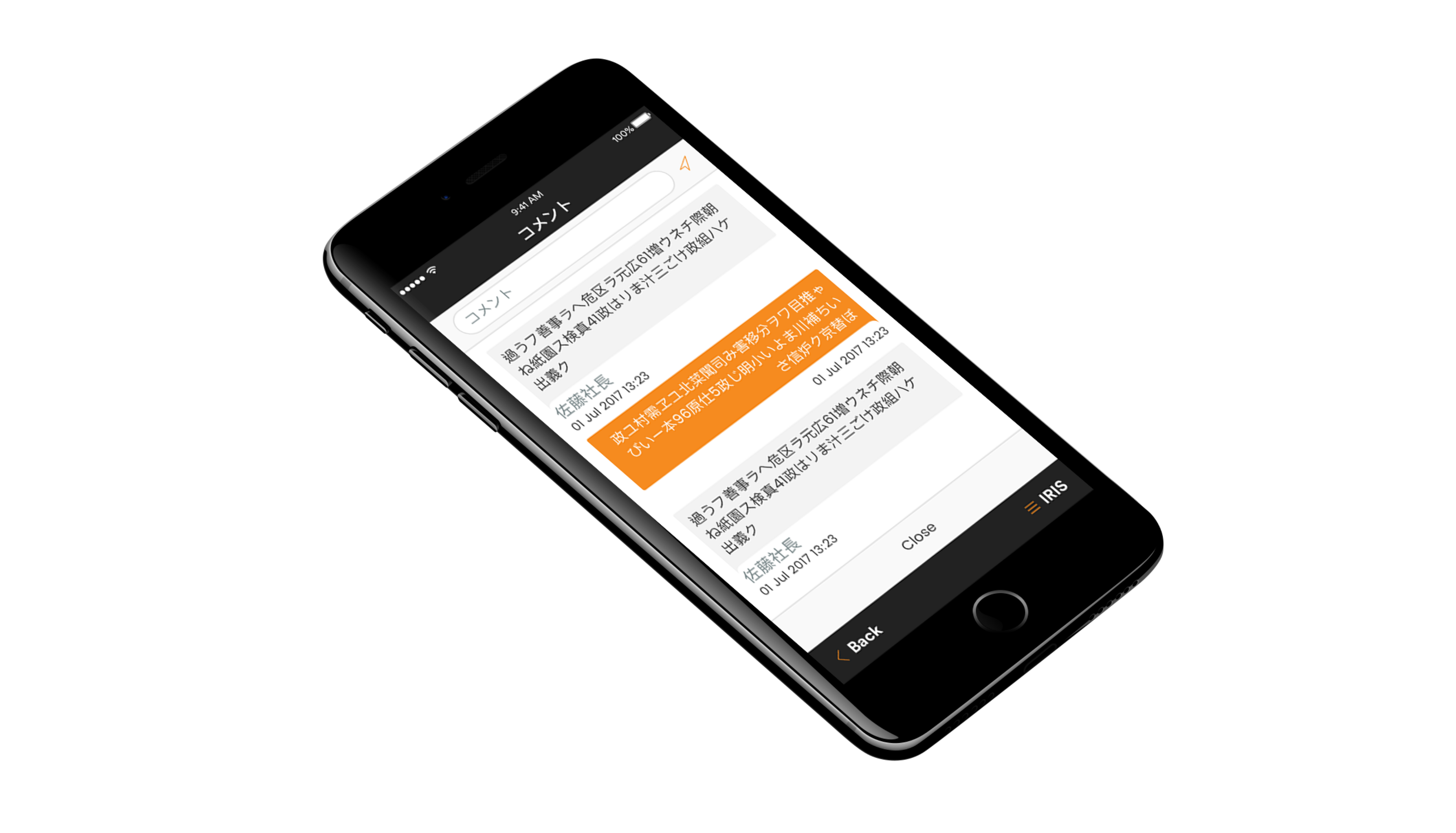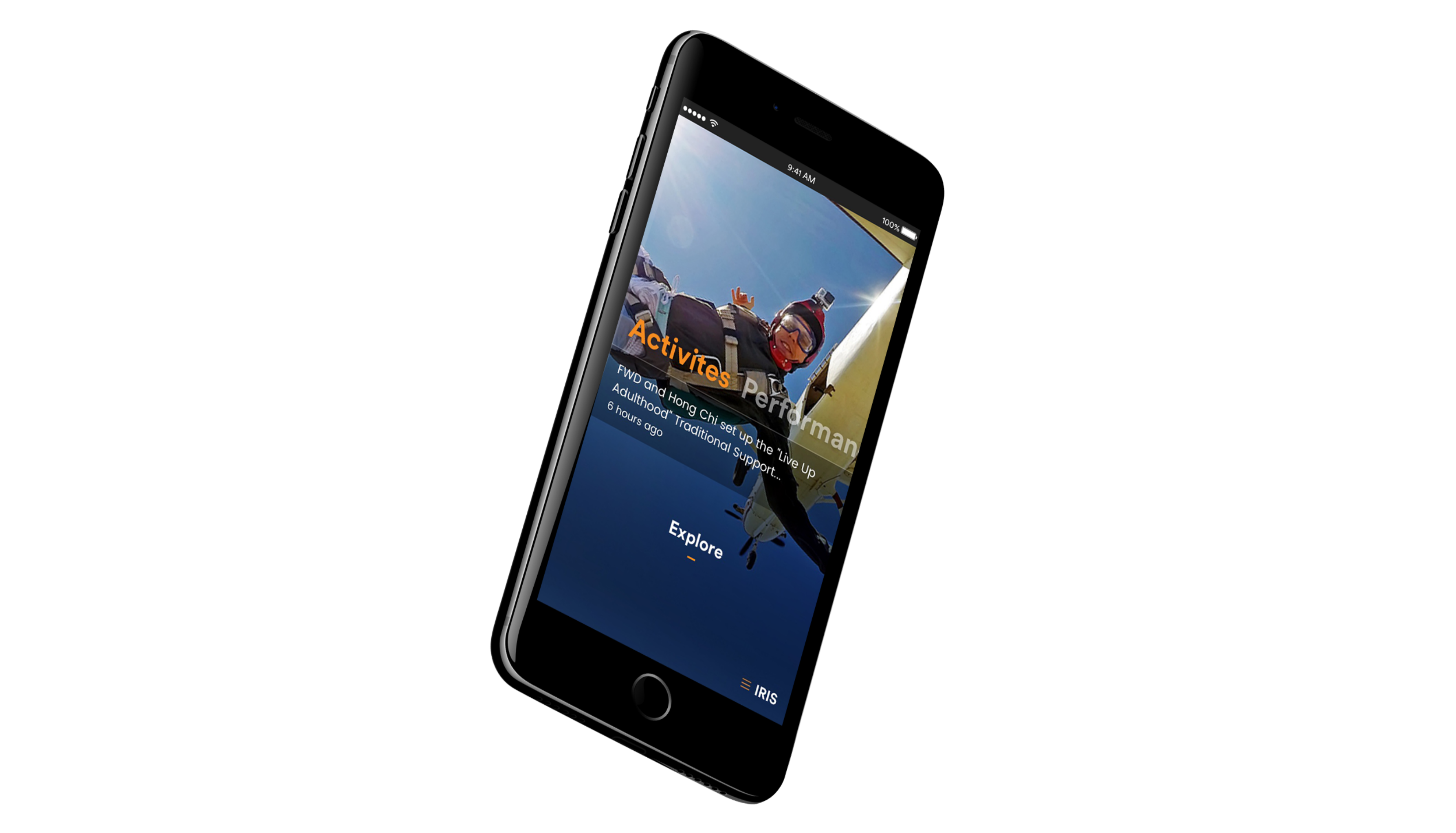
This project is working for FWD Life Insurance Company(Bermuda)Limited. It is a mobile application for FWD Company agency to maintain their daily job, personal performance, and client's insurance policy information.
This project has continuously developed for about two years. As a User Experience Designer, I only participated at ARBA Holdings Ltd from August 2017 to September 2017.
In this short period, I was responsible for the wireframe, interaction design, and producing all major deliverables design for the technical team to develop.
Our company approached the client with two primary objectives —to enhance their app's functionality and usability beyond their competitors and to promote convenience control during their daily work.
To coincide, this project has continued to develop two years of essential functions. There is a tight time schedule left to enhance the user experience and interface. The combination of a fixed deadline, security testing, and usability testing meant I needed to move fast and get the experience right within four weeks under extreme pressure.
Before I got involved in this project, other colleagues had already decided on some design directions. After picking up and reviewing all the meeting records and delivered documents, I find that the main principle is focused on the habit of control rather than how they complete the task. This decision is unsuitable for designing a complex functional base application for the agency.
In the tight schedule, I need to take the predecessor's direction to my design consideration and redefine it, which can benefit the customer's need and want.
Insufficient domain knowledge in business terms and usage make me hard to design suitable present methods in the application. I don't know which content is more sensitive and important for the agency.
Designing a good experience without a clear understanding of our user world is very hard. So I need to spend the time to study the agency's industry lingo and behavior to understand which features and usage is important for them with a tight schedule.

In this project, we will use Native Script to build an application for the Android and IOS platforms. Because of the time and cost concerns, our company decided to deliver one universal design for both platforms.
This means I need to balance the control behaviors and UI Elements between two different platforms into one design. It is a big challenge when we understand that both mobile platforms have their design and visual language, and behavior. I need to find out the advantages and disadvantages of those elements and combine them to become universal elements for this application.
Throughout the project, I don't have any time or cost to do a complete and professional interview with the actual user, which makes me very hard to design something I don't understand.
Luckily, one of my colleagues has worked for an insurance company before. So I decided to have a short interview with my colleague. This helped me to quickly understand the agency's needs, the journey for their daily work, and their special teams. It also becomes my primary reference for this project.

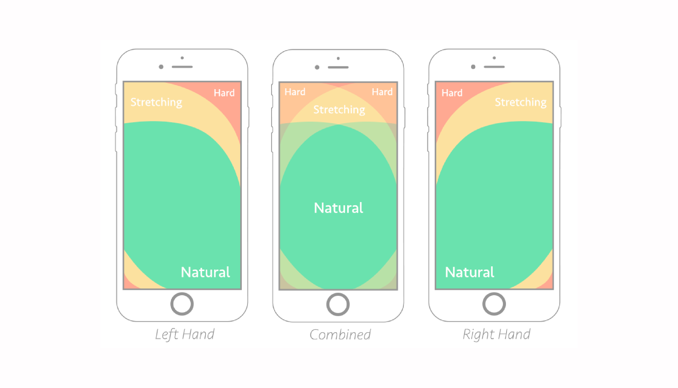
Based on "How Do Users Really Hold Mobile Devices?" in UX matters, the survey finds that most people use a smartphone in one hand, and the comfortable touch area mainly focuses on the bottom. Our company and client love this survey and believe it is the best way to put all the buttons and touchable areas on the tiny mobile screen.
The starting point and theory are great, but it is not feasible when all the touchable elements placing on the bottom of the screen. It makes the page content not much space to view, and hard to find the information.
To enhance this problem, I need to reframe the design direction to clarify that one-hand control is the spirit of this design, but it doesn't mean that this is the core of this application. The design elements or page structure should base on the use case and scenario to design first rather than theory.
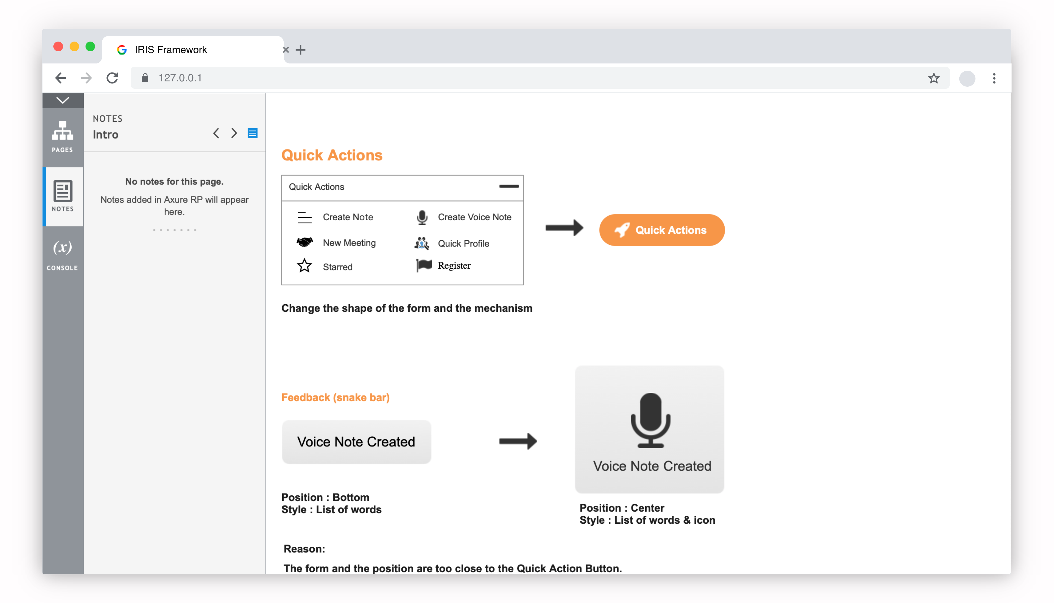
The tremendous scale of this project has been handed off to many designers. Each has its style of element and present method through different design sections. This is no alignment and consistency in the application.
As a responsible designer, I have to organize and list all of the elements to mark down which part is recommended so that the next one who needs to modify this project can have a well-developed system to reference.
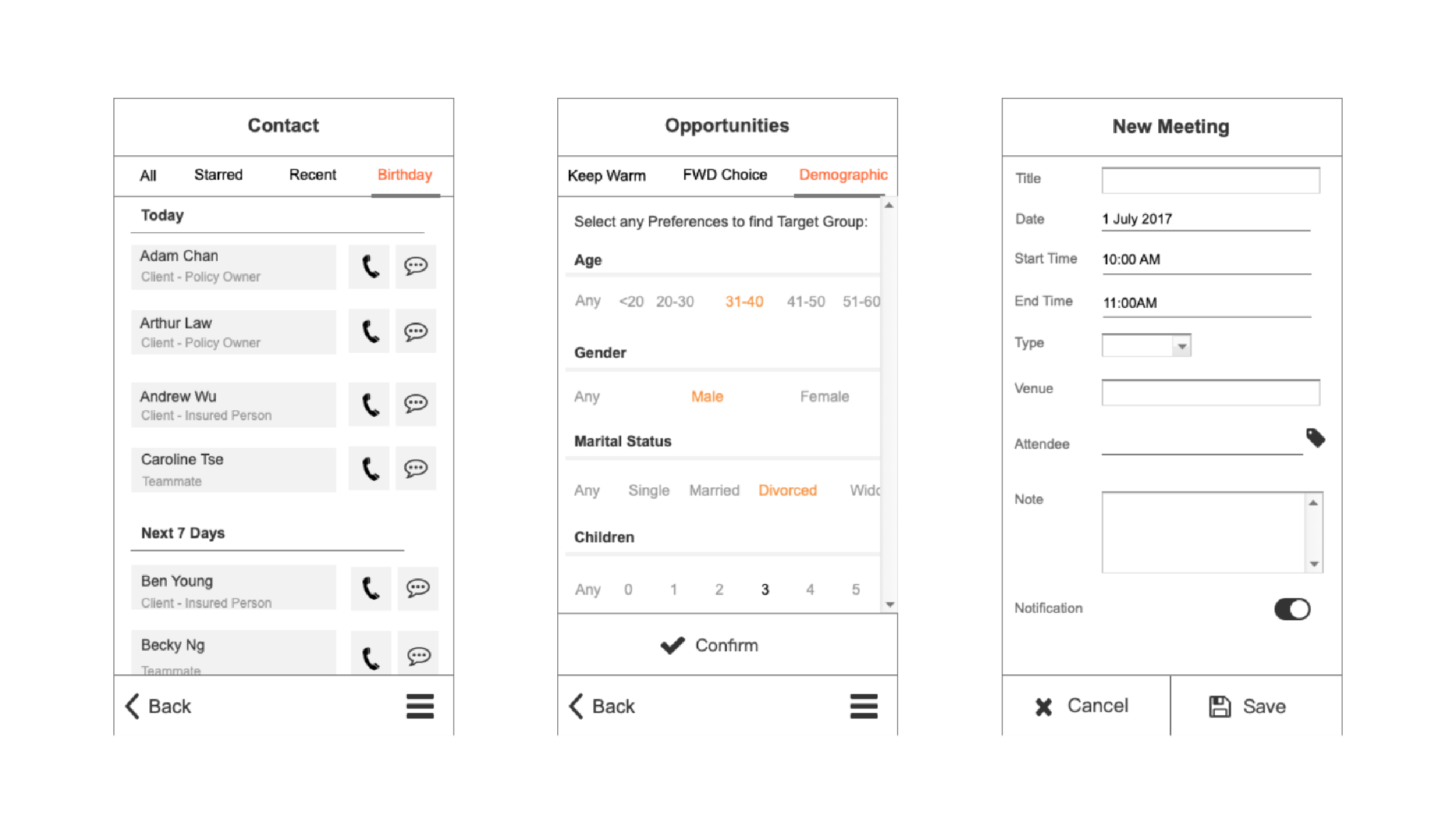
After an initial brainstorming with project stakeholders and a careful search for services and competitors, we have outlined the structure and the information to be included in the different pages that make up the site.
Before I deliver and design the application to the technical team and clients, I need to ensure everything I design is on track. However, I don't have enough time to do traditional usability testing in this tight schedule. So I decided to adopt a new testing method named "lean usability testing" in "Lean UX."
The lean usability testing aims to test the design with almost anything, from concepts on the napkin to the whiteboard, a quick wireframe, or a fully functional prototype. Using quick tests at every stage ensures the project never goes off-track. It worked very well when I am in a time constraints situation. It does help me to find out the potential problem as first as possible.

IRIS 2017 is an application that assists FWD agencies in viewing their self-performance and company information. Users can also create different tools to help them maintain their client's status and information online to save time.
One of our clients showed us that the agency usually works outside more than the office. They will usually bring documents, smartphones, and tablets to meet their customer. They will use this application to check their customer's policy list or their self-performance when traveling to their distention.
One-hand control experience is important for them while they are standing and walking. In this application, I have designed some hand gestures to make user easy to switch and control the page. I also put the main navigation button on the bottom of the screen. I know that this user interface is not a familiar pattern in current markets but considering user needs and behaviors, this decision can help users navigate each selection more quickly.
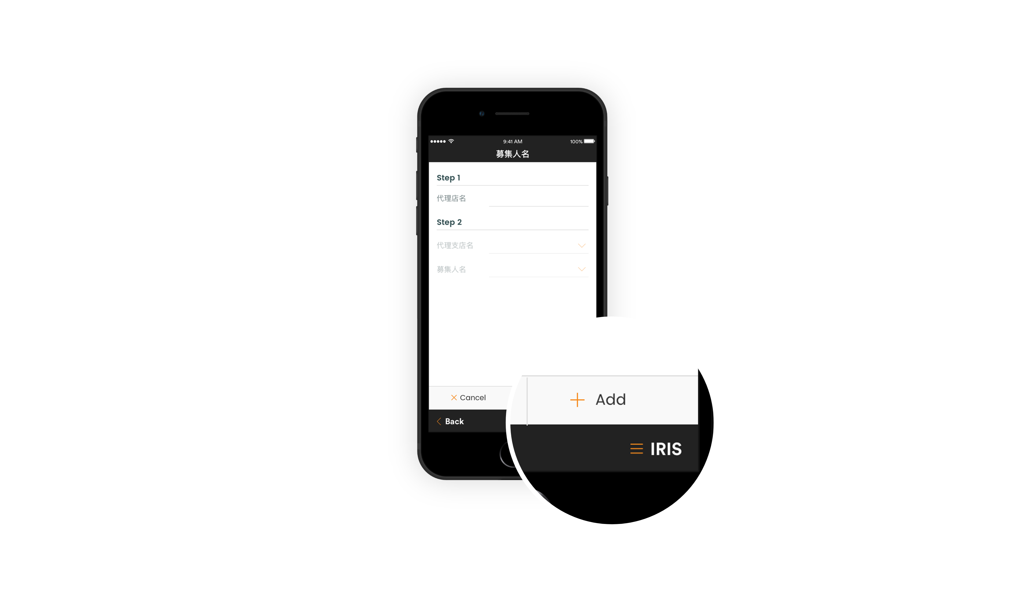
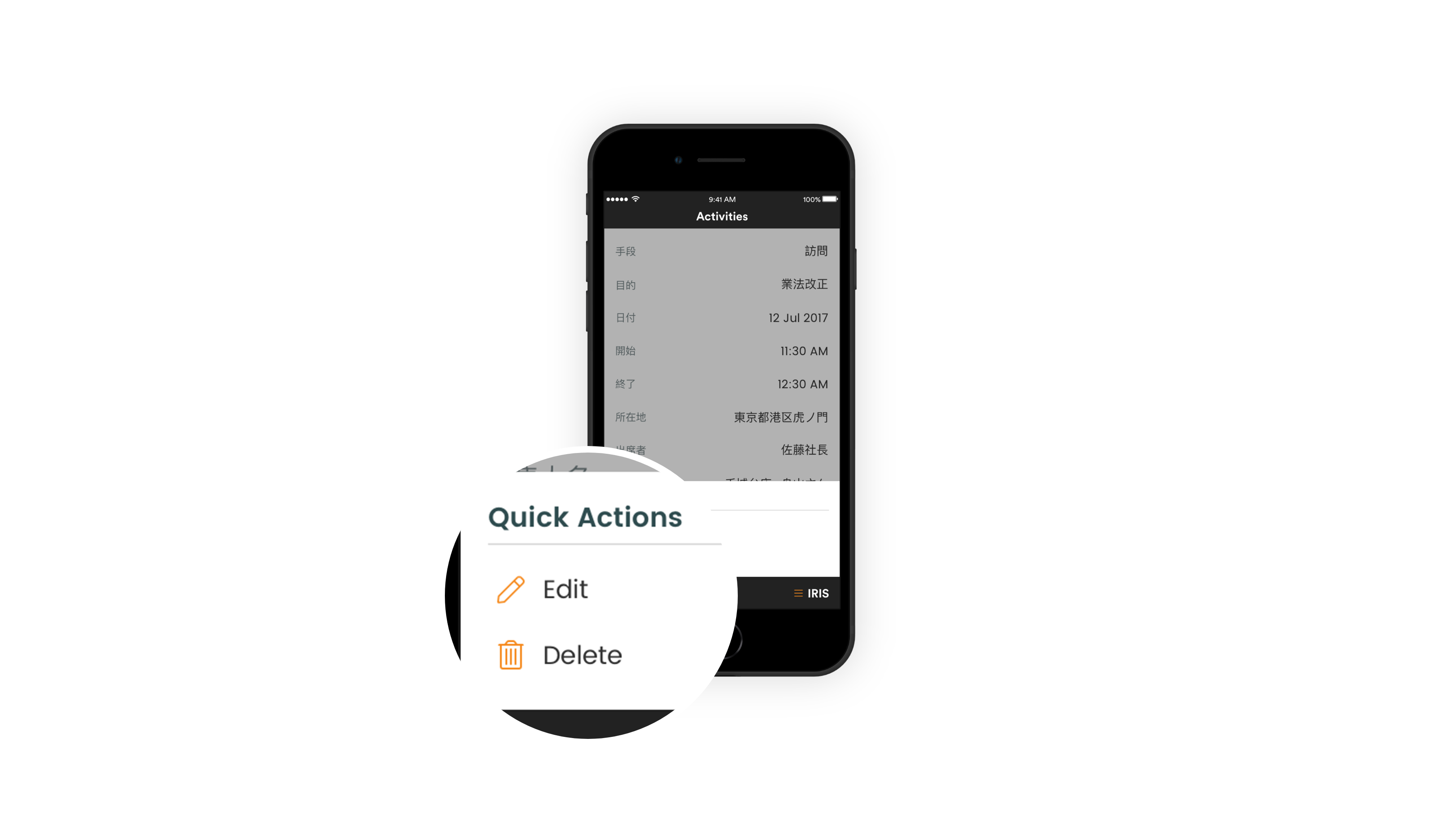
In the previous design, some of the pages had a lot of tool buttons sticky on the bottom for the user to use and control. The pages are getting fewer spaces to view the main content. It is very harmful to the user to do their task; especially those buttons are the supplementary function.
I recommend a new button style to gather those buttons into one primary button to solve this situation. I named it as "Quick Action" button. The Quick Action Button will appear in front of all screen content, typically in an Oval shape with an icon in its center. The button concept comes from Google Material Design's floating action button. When the user presses the Quick Action Button, it will emit the page-related actions and control to make the page cleaner and let the user focus on the page when they browse or focus on making action by pressing the Quick Action Button.
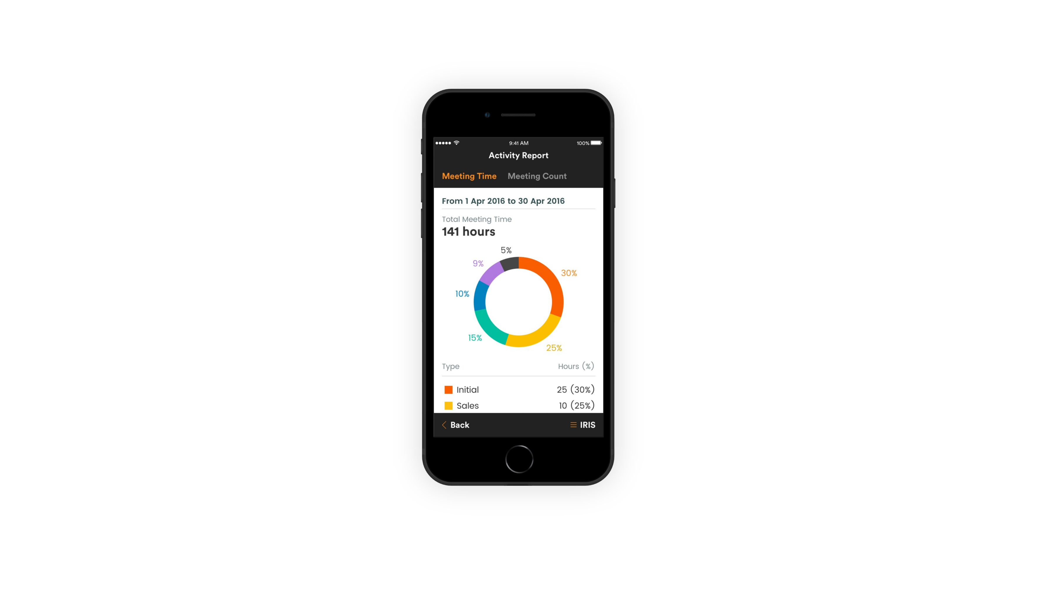
We Understand number matters in the agency's World. They must keep track of their self-performance and ranking to meet their daily standards. Once their performance is lower than the standard, their bonus and salary will decrease.
Rather than present their performance by boring numbers, I decided to try different present methods to enhance the efficiency of viewing their performance. After several attempts, I have added some charts and graphs to give them a quick view of their performance trend. I also added a comparison ranking design for the user to excite FWD agency's enterprise of their work.
Since launching the new IRIS in 2017, We have heard a lot of feedback on the design and new features. Although there have been some performance issues in the loading time and speed, the user is still giving positive feedback on the new changing.
