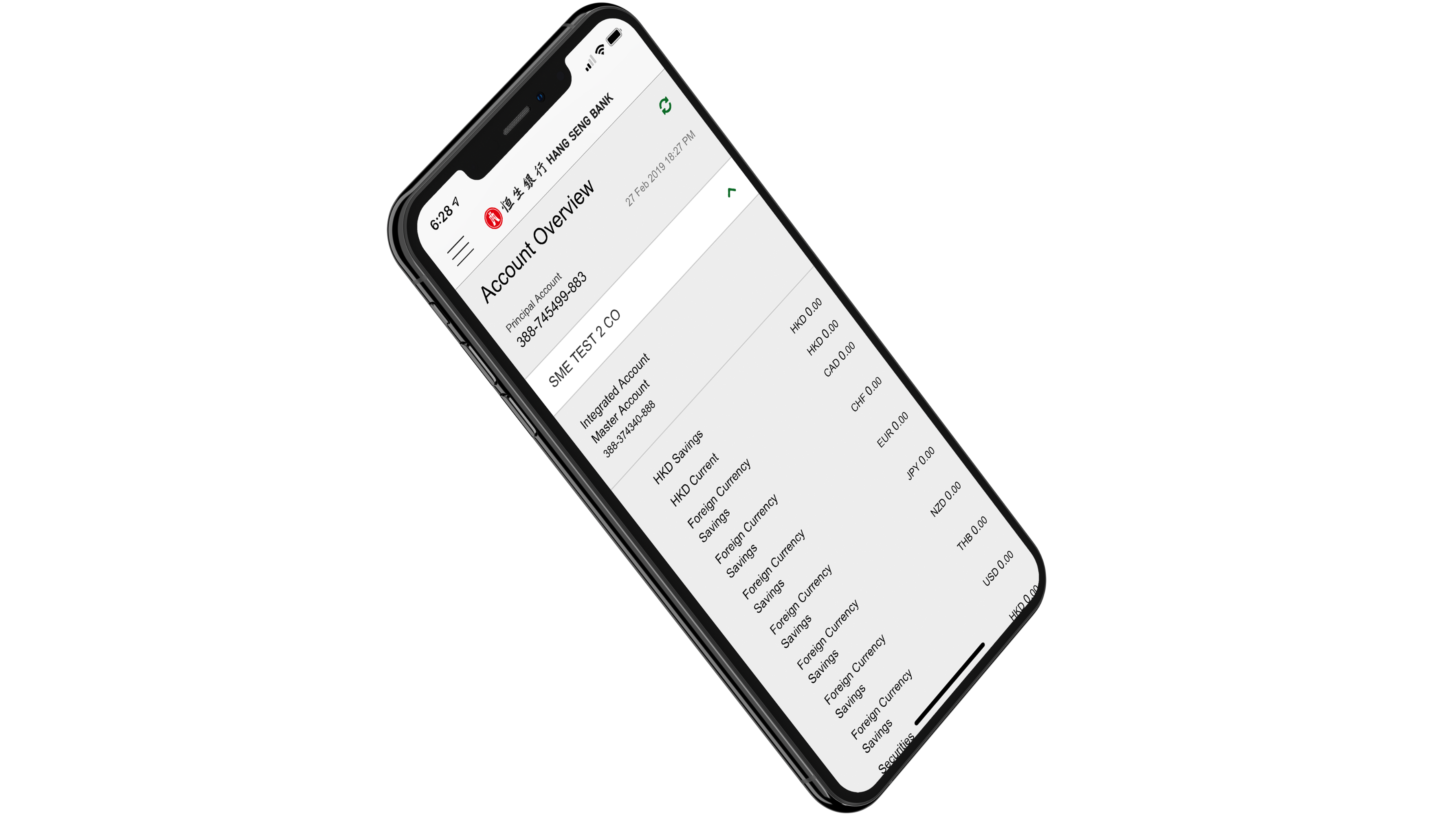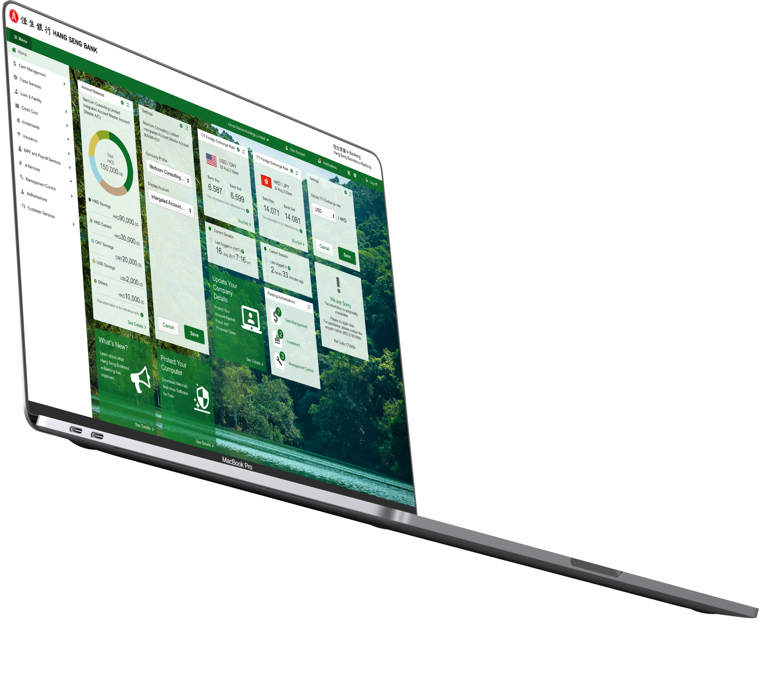
Business e-Banking services are designed for small and medium-sized enterprises to help lower operating costs and save time managing the company’s finances.
Hang Seng Business e-Banking has been built over decades. The re-platforming project will be important since online technologies move at a frightening pace, and it is a big problem for businesses that operate online and want to keep up with the latest new trend or techniques.
This project took place between September 2017 and February 2019. I worked on this project as a User Experience Designer at ARBA Holdings Ltd.
I was part of a small team alongside William Ng's Team. I was responsible for the research, interaction design, experience strategy, prototype design, usability test, and producing all major deliverables design and presenting these to the client for Hang Seng business e-banking platform and the mobile application.
The analysis of the collected information allowed me to better understand their characteristics and the features that would work best for them.
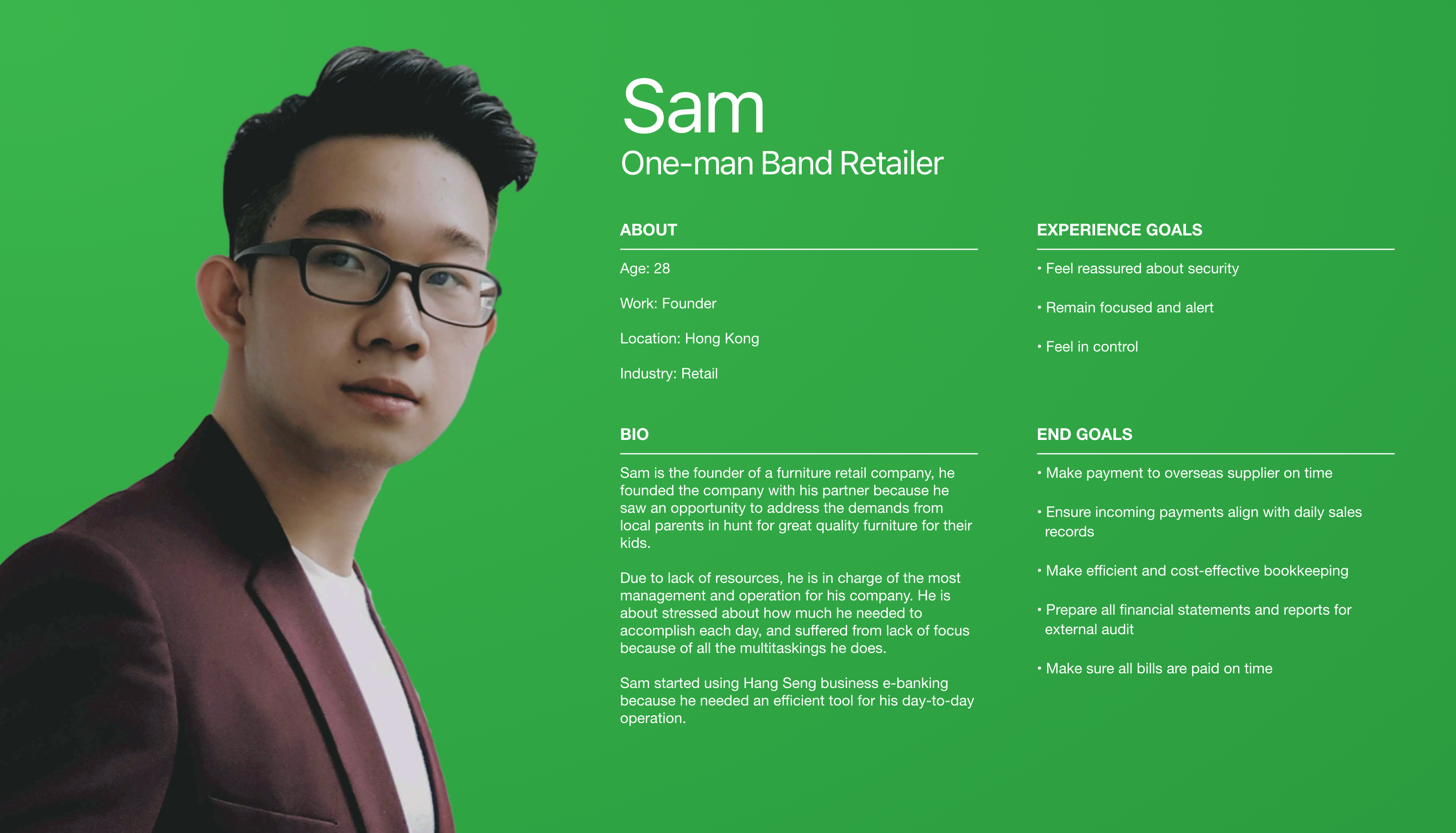
Then, I explored their experience with the current scenario by processing User Journeys and highlighting them. After identifying the technology and the user's needs, we could map out their journey to helps us better understand the process or steps needed for the user to perform each use case.
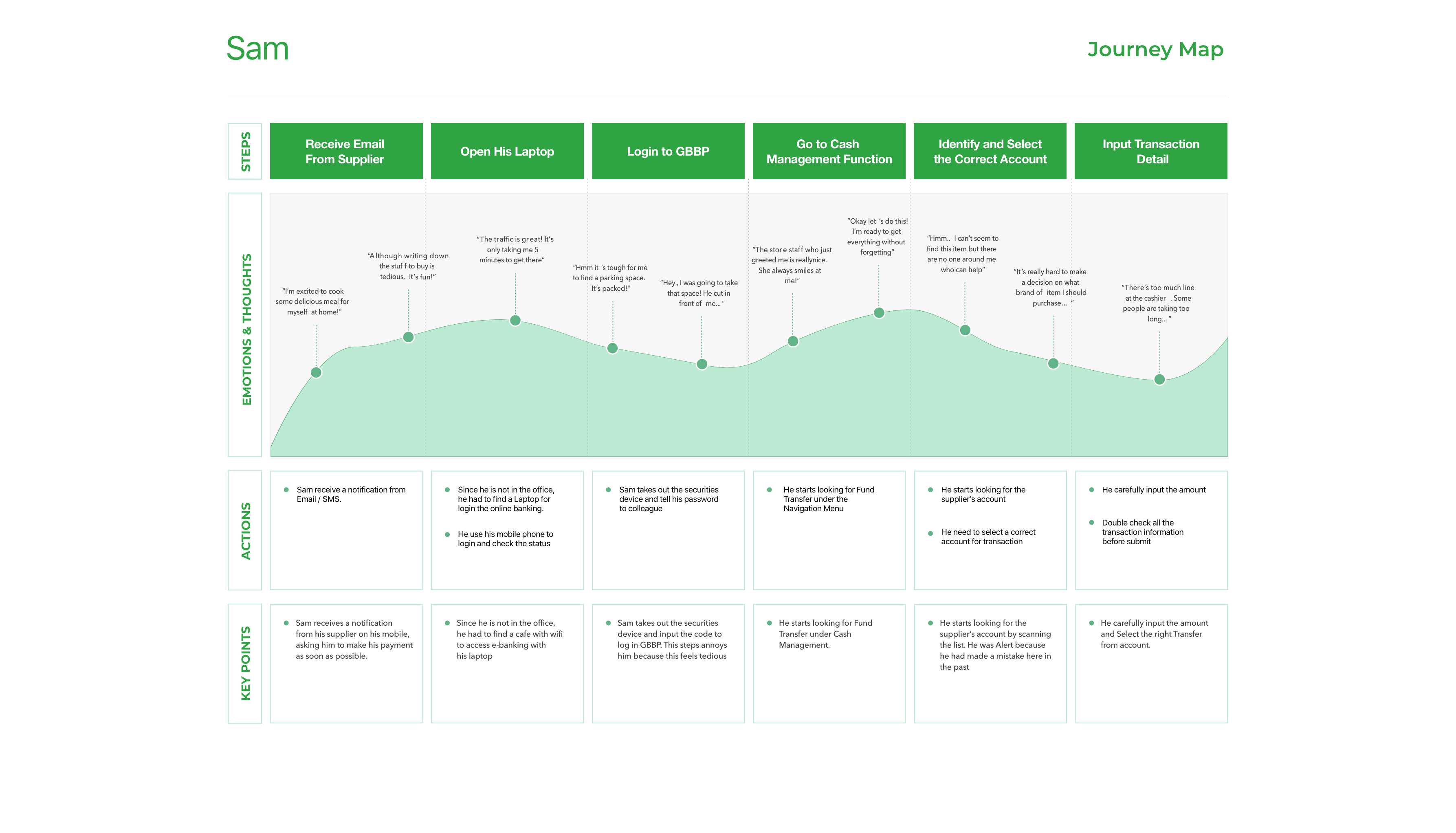
Based on the information collected and the use of UX tools, it has therefore emerged that:
The ideation phase begins with re-elaborating the flow of use of the platform to make the experience more fluid and simple, having in mind the tasks to be completed.
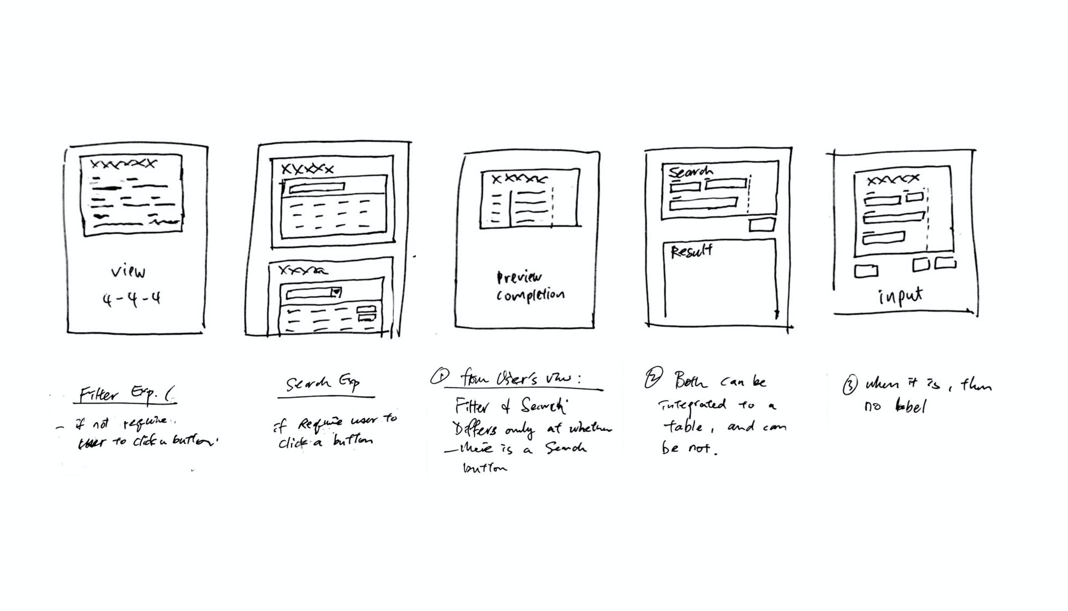
Usually, I will start to sketch my designs on paper. Sketching many concepts or user interfaces earlier can ensure a more cohesive design. So that my team could evaluate it more efficiently, and it worked rapidly and led me to consider more fresh ideas.
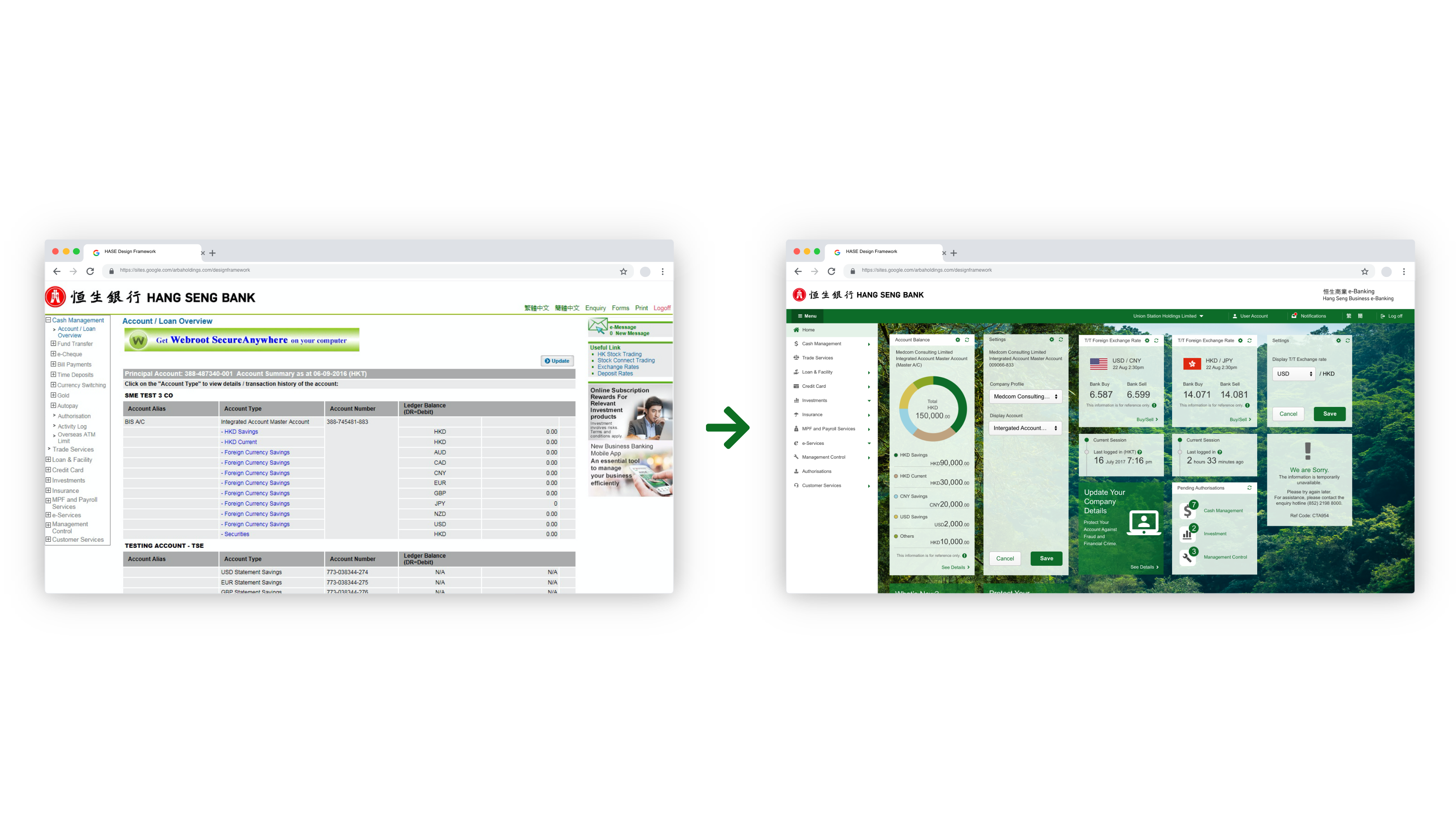
Unlike the current solution, the new layout proposal is not a division of functionality that the service can offer but rather a division by goals. In the Define phase, we saw what those personal's needs and objectives were, and based on these; we went to build the new interface, which is divided into three navigation paths: Main Navigation, Main Task area and support panel.
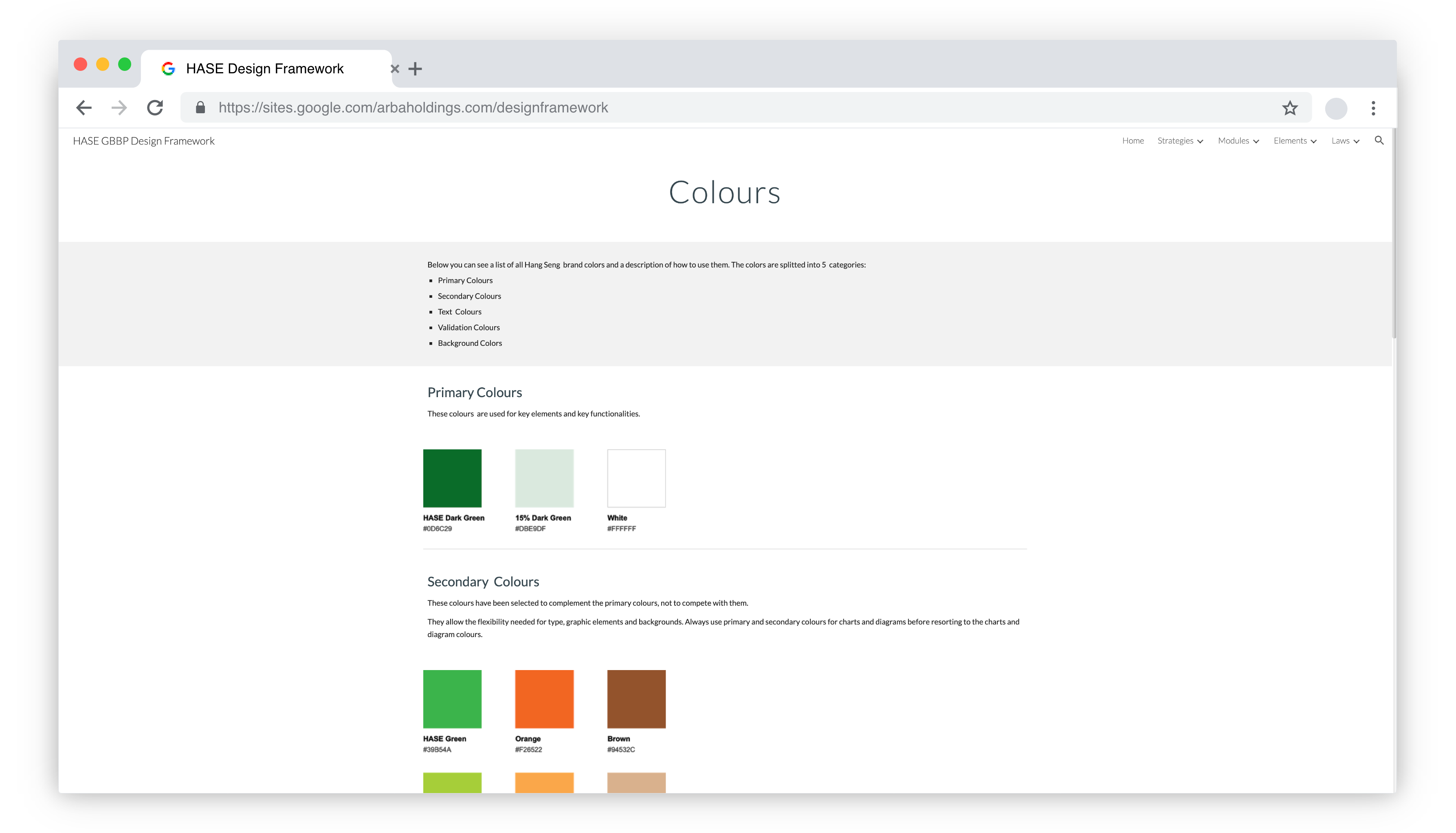
The tremendous scale of this project and the team's growth has made us realize that a set of rules needs to be established. This framework will demonstrate the usage and treatment of UI elements, interactions, layout, and IA. To make our established design aligned with this platform.
After exploring multiple solutions, we went to build high-fidelity prototypes in Axure RP and started doing usability tests. Since the online e-banking platform has too many features and functions designed and needed to test out, we decided to separate each function into a small batch and test it with five current customers.

Sometimes the test went smoothly. After a first hesitation, the user managed to reach the dedicated section; in other cases, he remained stuck at a point where he seemed unable to advance.
Prototype and test are the two phases in which I had to go back more often. As the usability tests highlight new usability or interface problems, we will evaluate the design base on the result. It was a very meaningful process to sort out any potential issues highlighted and fixed before launching the product.
It is a self-analysis process that helps not only to remain well focused on the objective but also not to take for granted that the solution you are designing is the best for everyone.
During the project, we want to understand the user's point of view to evaluate and judge our re-platformed function. The client has a similar way of evaluating their platform. Still, it includes one quest to score in the past, which is not enough because it can't show which kind of function or specific usability area is not good enough.
So I enhance the survey's question to focus more on usability problems in a specific function, making the survey result more meaningful to use and finding out the problem directly.
Besides that, I propose each delivery batch should have an online survey for the user to evaluate and judge our re-platformed function. It is because we understand user experience is not a one-time event. Understanding the user feedback and comment after the product has been launched is important to enhance our design better and better.

Hang Seng Business e-banking is a web-based tool that assists Small and Medium Enterprises in managing their business operation for their needs. The user can create and maintain different business instructions online to save time.
The new homepage is like the dashboard of a car. There are gauges that tell us everything the users need to start working on your important tasks.
There are also warning lights, and messages from the bank, to tell us what we need to watch out for. In other words, the homepage gave the users a sense of being "In Control" via a comprehensive account summary.
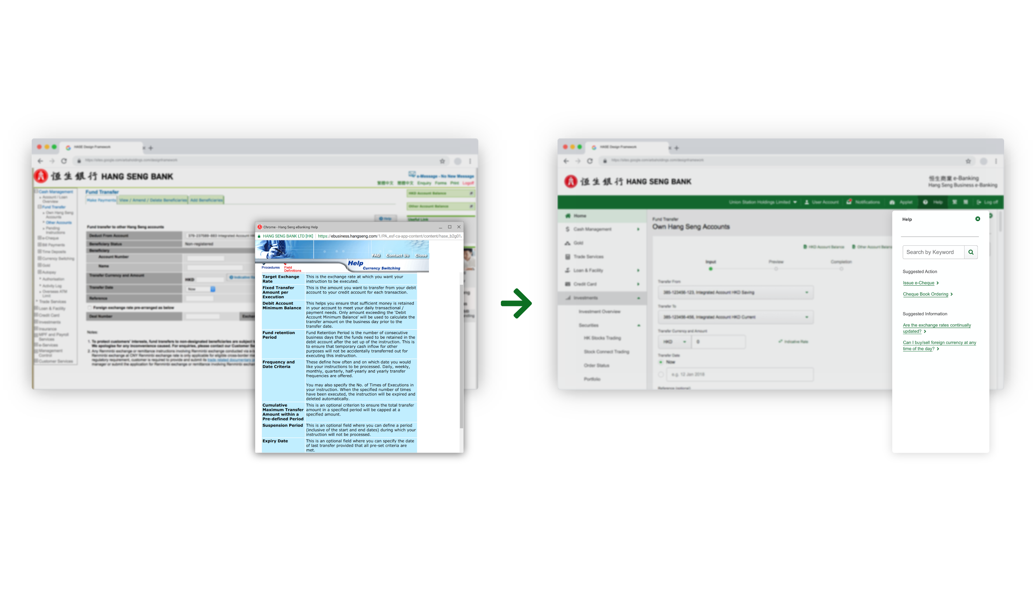
The system knows what you are doing and automatically displays relevant information to support your decision. For example, suppose you want to transfer money to a third-party account. In that case, the supporting panel on the right-hand side will automatically include the “Account Balance Summary” information for the user to reference.
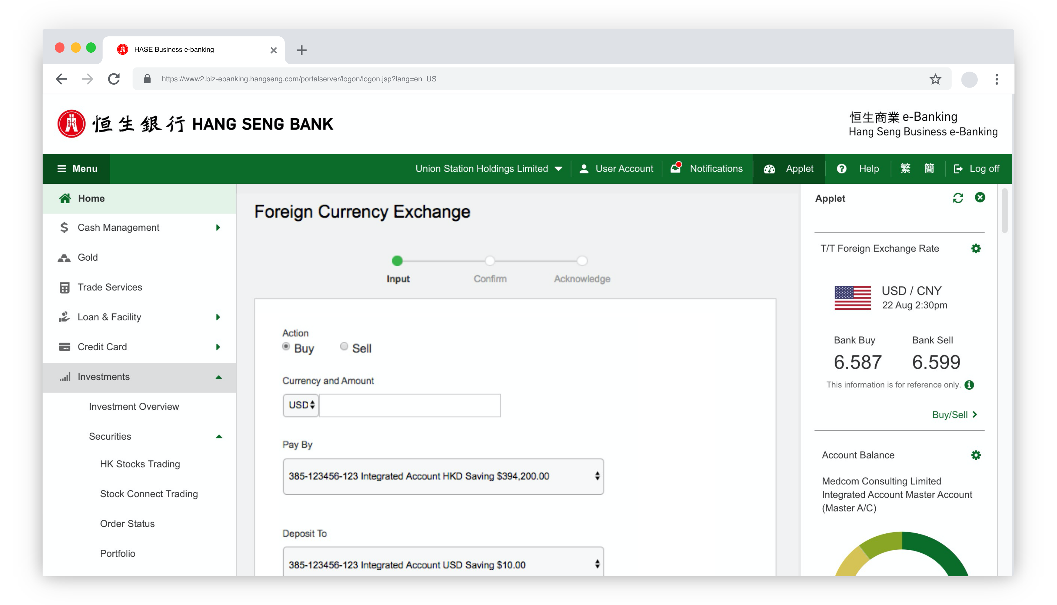
Before the redesign, many supplementary pieces of information did not have a system too well organized; some put it at the bottom of the page, and some used another pop-up window to show the information. It suffers a lot of problems. Such as the, referencing requires scrolling up and down the page; it takes more cognitive effort to know which field the note is referring to.
We have introduced a new access area with a search function, note, remark, frequently asked questions, etc., which is to reserve 1/3 of the page when the User is required to fill in the form. This layout can separate the workflow from the referencing content, and experienced users can ignore the column.
Since launching the new Hang Seng Business e-banking platform in 2017, their profile, user engagement, and satisfaction have grown substantially.
It helps to raise Hang Seng Bank into the leading organization for providing Assistive Business information for SMEs.
When I look back on what I have done on this project, I find that there were some core challenges that our team may need to pay more attention to improve:
This project has many stakeholders, such as business, IT, Security, RC, etc. Each department has its explanation for this project. Some of them think it is just a project to reskin the platform; some want to improve the product's functionality. They did not have a shared vision across the whole project, which meant I needed to educate them on the true value of user experience before starting to deliver the design.
In this project, the back-end development will respond to Hang Seng IT. During a few meetings with the Hang Seng IT team, we realize that the techniques have too many limitations. They were using ten years ago back-end coding and server. So our design has so many limitations, and it has caused a lot of performance issues since we are designing based on the user's needs, not their server.
To make things work, we need to balance user needs and technical execution concerns. We have changed our approach to have more meetings with the technical term. Work with them closer to understanding the limitation before designing a final vision.
Our lack of domain knowledge in business meant we needed to understand the bank service provision's nature thoroughly.
We approached all aspects of the project collaboratively and spent most of our time working on the Hang Seng business analysis groups to understand the different features and their usage.
This project was a journey far from obvious; I often questioned myself in the light of the feedback obtained along the way. Some activities have remained particularly impressive because of the unexpected implications, such as the Test phase, in which I had the opportunity to see the reaction of people and to understand how everyone approached the app differently.
In the following projects, I will pay more attention to the design opportunities regarding the inclusiveness of people. Adopting a methodology so close to the needs has allowed me to understand how important it is to have a project at heart that allows you to improve people's lives, and it is gratifying to know that it has a real and strong impact.
